Message Faiz
or email hi@faizintifada.com
Foundations
The design system of this site: color, type, layout, shape, motion and interaction, with live samples.
Tokens in src/styles/global.cssPhone 390 to desktop 1440
Contents
Principles
- One column, one grey. All text sits in a 600px column; secondary text is one grey at 65% black.
- Photos carry the page. Media may break out to 960px; text never does.
- Contrast by lightness. Links, names and titles are full black; everything else steps back.
- Motion is feedback. Short, ease-out, transform and opacity only, and none for keyboard input or reduced motion.
- Nothing is a dead end. Every control has a 44px hit area, a focus ring, and a real target.
Color
Neutral, near-black on white. The accent is the brand orange, but it never carries text. Ratios are WCAG 2 against white unless the row names another surface.
Text
- Primarytext-fgTitles, headings, links, names#0a0a0a19.8:1
- Secondarytext-fg-secondaryBody text, captions, meta, section labels#606060 (65% black)6.3:1
- On darktext-whiteText on photos (with scrim) and dark bands#ffffff19.8:1 on #0a0a0a
- On dark, secondarytext-white/65Dates and labels on dark surfaces#a9a9a98.4:1 on #0a0a0a
Surface
- Pagebg-bgPage background#ffffff
- Subtlebg-bg-subtleCallouts, code blocks, demo frames#f9f8f6Secondary text 6.2:1
- Mutedbg-bg-mutedImage placeholders while loading#f2f1ef
- Hoverbg-bg-hoverHover fill of icon buttons4% black
- Inversebg-bg-inversePrimary button, dark band, video frame#0a0a0a
Line
- Borderborder-borderCode block ring, card outlines8% black
- Dividerborder-border-subtleList rows, footer rule, table rows4% black
- Photo edgering-black/10 (inset)1px edge inside every photo and screenshot10% black
- Photo edge, darkring-white/10 (inset)The same edge on dark surfaces10% white
Accent and status
- AccentaccentBrand, contribution graph. Not for text#ff63082.98:1, fails for text
- Focus ring--color-focusKeyboard focus outline, 2px, offset 2pxoklch(0.62 0.186 42.2) ≈ #dd54013.9:1 (needs 3:1)
- Successbg-successOnline dot on the contact avatar only#28c840Not for text (2.2:1)
- Success texttext-success-text“Copied” on the hero email#0c84634.7:1
Work tile gradients
- Purple-pink → orange-gold
- Grey-blue → deep brown
- Mist-blue → deep sea blue
- Mist-blue → ink green
- Lavender → midnight purple
- Sky-grey → rust red
Shown without blobs and grain. The tiles add four blurred blobs and 1px grain (128 ± 70, overlay 0.4).
Typography
Geist for everything, at two weights: 400 and 500. Paper Mono only for labels on photo prints and for code. Four sizes — 13, 14, 16 and 18 — at 1:1 pixels.
- Largetext-large · 18 / 1.35–1.5AI Foundation for DeveloperPage title, quote
- Bodytext-body · 16 / 1.6 · 400I design and build digital products, from the first frame in Figma to the live release.Body text, intro
- Body strongtext-body · 16 / 1.4 · 500The problemHeadings, card and row titles, names
- Secondarytext-small · 14 / 1.6 · 400Selected workSection labels, sub-lines, contents list, small links
- Metatext-meta · 13 / 1.5 · tabularOct 20 · 23:09 · 62 peopleDates, counts, captions, durations
- MonoPaper Mono 13 / 1.65 · −0.3pxIT Fair Bootcamp UIN SGD Jun 2026Photo-print labels, code, file names
- Lines stay near 75 characters: 16px in a 600px column.
- Numbers that line up or change use tabular figures: dates, counts, durations.
- Titles use
text-balance, paragraphstext-pretty. Real characters: “ ” ’ … — · - Weight never changes on hover. State shows with color or an underline.
Layout and spacing
Three tracks on one page grid (.page-grid). They shrink on their own: at 768px the breakout is 720px, and on a 390px phone both content and breakout are 350px. Side gutters are 20px, and 24px from 640px.
col-breakout or col-full; the default is content.- Full1440pxEdge to edge (the work carousel and swipe rows scroll here)
- Breakout960pxWide images, galleries, video grid, photo stack
- Column600pxAll text: about 75 characters per line at 16px
Spacing in use
- 4Icon to text in small links
- 8Inline gaps, list item gap
- 12Image to caption, gallery gap
- 16Heading to content
- 24Gap between cards, between carousel tiles
- 40Header to article body
- 64Body to footer
- 96Between home sections
- 120Before Selected work and before the footer (80 on phones)
Shape and depth
Radius grows with size. A nested surface takes the outer radius minus the gap between them.
- rounded-md6px · Duration badge
- rounded-lg8px · Small thumbnails, buttons in code bars
- rounded-xl12px · Code blocks, callouts, list rows
- rounded-2xl16px · Photos, video thumbnails, demo frames
- rounded-[18px]18px · Avatar (56px)
- squircle32px · Work tiles, with corner-shape: squircle (16 elsewhere)
- rounded-full∞px · Icon buttons, pills, status dot
Edges and shadows
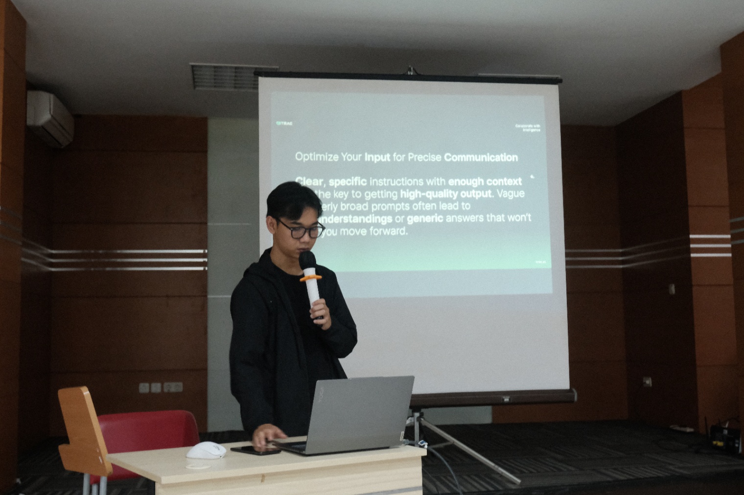 Photo edge. 1px inset ring, 10% black (10% white on dark). Every photo has it.
- Avatar.
shadow-avatarwith a 2px white outline. - Photo print.
shadow-print: a 1px ring, a tight shadow, a soft one. A lifted print addsshadow-print-lift.
Elevation
One light from above, so every shadow falls down and is pure black: a tint looks dirty next to the photos. A surface that sits higher gets a larger, softer shadow. Floating surfaces add a hairline, so the edge stays sharp on white.
- shadow-printPhoto prints at rest
- + print-liftAdded when a print lifts
- shadow-avatarAvatar in the hero
- shadow-buttonPlay button on a video
- shadow-pillComposer pill
- shadow-floatContribution tooltip
- shadow-overlayHover card of a tool or link
- shadow-dialogContact card
Motion
Four timings. Press a row to play it on its real curve.
- Animate
transformandopacity(and color). Never width, height or position. - Keyboard switches are instant: no fade when arrow keys or Tab change a preview.
- Hover effects only on devices that can hover. Reduced motion turns all of it off.
Interaction
- I founded VibeDev ID.Text link. Black, underline at 30%, full on hover.
- YouTube channel Small link. 14px grey, black on hover, 44px tall hit area.
- Icon button. 32px circle, 44px hit area (dashed). Off: 35% opacity.
- FocusedFocus ring. 2px, offset 2px,
--color-focus(3.9:1). Keyboard only.
- No
href="#": items without a page are plain text. - Hover never hides content: captions also show on keyboard focus and on touch screens.
- Phones have no fixed contact avatar (it would cover text); the header avatar opens the contact card.
Icons
One set, 24px grid, 2px stroke, currentColor. Icons are decoration: a button with only an icon gets anaria-label. Sizes in use: 12, 14, 16 and 22.
- arrow-left
- arrow-right
- arrow-up-right
- download
- copy
- check
- play
- lightbulb
- presentation
- video
- link
- chevron-down
Tokens
In src/styles/global.css:
--color-fg-secondary: 65% black (6.3:1), all secondary text.--color-focus:oklch(0.62 0.186 42.2), used by:focus-visible.text-meta,text-small,text-body,text-large: 13 / 14 / 16 / 18 with their line heights.--shadow-*: the elevation scale, fromprinttodialog.--ease-out,--ease-in-outand--ease-lift..page-grid,.page-sub,col-breakout,col-fullandpad-content.